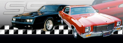
OMG !!!! Theres a flaw in our
#12

Hi `Rick, great thread & observation 4-Sure


Disclaimer: Administrator `Taz (Lou) and Staff had no input on our MCF Forum's Header/Logo/DeSign  It was created by Internet Brands Tech or Design Department.
Mod J.J. or Taz created the one in our MCF Member's Blog.
(I personally like it better 4-Sure: )
 It was created by Internet Brands Tech or Design Department.
Mod J.J. or Taz created the one in our MCF Member's Blog.
(I personally like it better 4-Sure: )

 When I first noticed the 4th Gen with the steering & driver on the right side
  I just thought it was built for oversea countries, because the MCF is a International/World Monte Carlo Forum
  What
What  Yes, 4-Sure ~>
  Maybe
Maybe  It's a one of a kind
  LOL
LOL  Maybe
Maybe 

Maybe we should have a Photo Shop DeSign contest with member's ? Then we could vote for the best design & submit it to the Owners/IB Personnel for a change ?
If not, we just just tell everyone that it's a special built 4th Generation Monte
 , because the Monte Carlo is such a Special Vehicle ~> 4-Sure...
==========================================
I do like the below one designed by Mod J.J. & Admin `Taz


^^Sorry, I Tagged `it...I think I'm still on ReCharge : ) Zzzz's
Last edited by Space; 10-21-2011 at 05:17 PM.
#18

Then the MCF logo is placed in one cell and the SS w/ the cars is in the other. That way, they will stay perfectly in the corners no matter the resolution of your browser. The resolution of your screen dictates how far out they spread and sometimes they don't stretch far enough so they double the checkers since the checkers design is part of the background instead of making it a transparent PNG.
You'll notice if make your browser a window instead of full screen the logos will come closer together. And if you stretch the window from the right side, the cars will move as you stretch the window.
Can you tell I code websites and software for a living?
#19
Can you tell I code websites and software for a living?

Hi `Mike, I believe it now
 WoW...Do you like your job ?
I get confused by all those codes (etc)
Thanks for your post & explaining...Now we know who to contact `if we can get the powers that `be to correct or make us a new one : )
How's life in Cleveland, Ohio area. How do you like the Ford Fusion...One of my senior friends has one & they love it.
Thanks for your contributions. Have a Super WeekEnd/Life

#20
I've noticed that before, too. But actually, that's not the logo, that's part of the design of the site. The head of this site is placed in a "table" and the background of that table is the checker design...

Then the MCF logo is placed in one cell and the SS w/ the cars is in the other. That way, they will stay perfectly in the corners no matter the resolution of your browser. The resolution of your screen dictates how far out they spread and sometimes they don't stretch far enough so they double the checkers since the checkers design is part of the background instead of making it a transparent PNG.
You'll notice if make your browser a window instead of full screen the logos will come closer together. And if you stretch the window from the right side, the cars will move as you stretch the window.
Can you tell I code websites and software for a living?
The tech department found the pictures of those three Montes on the web. Don't know who they belong to. I suppose if someone is really ambitious and bored, you could go searching to find out who's cars they are.
I noticed the quick reply box is actually blue instead of grey. I know why though. And it's not my doing. lol. Unlike the username colors. I did those.
Thread
Thread Starter
Forum
Replies
Last Post
StrongTakeover
General Monte Carlo Talk
11
08-25-2011 11:45 PM


