
new buisness cards?


i have been working on making a new buisness card as i am almost out of my old ones and this had mt dedicated email on it and facebook page, i'm just kind of on the fence if i want to use this one or not
This is the new design, i still have yet to do a little tweaking
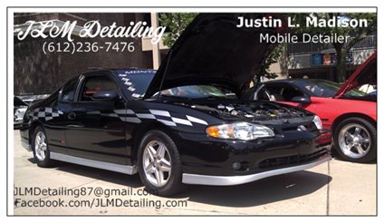
what do you all think
This is the new design, i still have yet to do a little tweaking
what do you all think

Monte Of The Month -- August 2014


Joined: Sep 2008
Posts: 25,145
From: Southeast PA

I think your text is hard to read, and close to the edges. You have a lot going on with that business card that makes it a little tough.
Typically I refrain from having a customer/company use a full-color photo as their card. If you want to use a photo, I usually have them put it on the backside of the card with their information on the other side.
Also, do you have permission from the Camaro owner?
Typically I refrain from having a customer/company use a full-color photo as their card. If you want to use a photo, I usually have them put it on the backside of the card with their information on the other side.
Also, do you have permission from the Camaro owner?
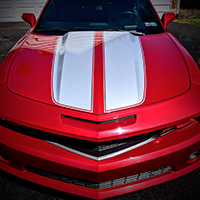
i was actually thinking the huger orange pulls too much attention from anything on the card,
kind of the addage less is more
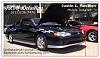
This is my old one and i realized that i should have taken the time to try different fonts, Capital JLM the whole way throught ect,
 blacked out address and email as it's irrelivant i also will not be putting one on there as i don"t have a shop ect,
 should i just do somthing like that again but with my updated infromation, ect, i plan on just doing a single sided card with a blank back
Monte Of The Month -- August 2014
Joined: Sep 2008
Posts: 25,145
From: Southeast PA
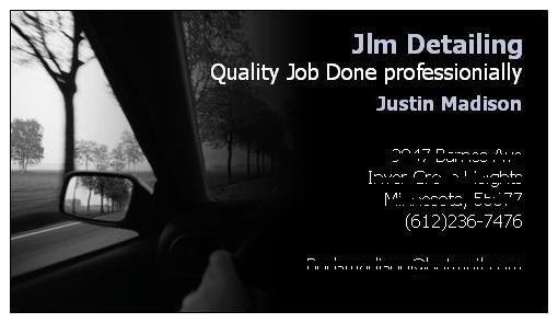
That card layout is definitely easier to read and follow. You aren't looking at a picture of a car and then noticing it has words.
You are noticing the words and then seeing the picture (how it is supposed to be)
You can play around, take pictures of sections of the clean pace-car and since it is black you can easily put the text on the black part of the car.
Maybe use a macro shot near the pace-car flags?
You are noticing the words and then seeing the picture (how it is supposed to be)
You can play around, take pictures of sections of the clean pace-car and since it is black you can easily put the text on the black part of the car.
Maybe use a macro shot near the pace-car flags?

Monte Of The Month -- January 2010
Joined: May 2009
Posts: 8,464
From: San Jose, CA
I would have to agree with Mike. While I love the picture of your Monte on the card, I think you should either completely simplify the card, OR fade out the picture of your Monte, and use it as a faint background to the card. Your font definitely needs to stand out more and be easier to read. As is, the e-mail address blends into the tire.


Monte Of The Month -- March 2013


Joined: Jun 2010
Posts: 8,442
From: michigan
I see a lot of flyers or print ads that have a picture in the background but it is faded out or lightened up. Then the print would be over it kinda like your old card where the picture is there but it's no the focus of the card.
been playing some more

This one i would have to move the JLM detailing in a hair otherwise i risk it getting cut off and blured out the Mercedes logo since obviously i don't have permision to use thier logo

every car i detail and take pictures of i make sure they are ok with me publishing them and using them to promote my buisness i have actually had a few people perfer i don't so never took pics
AND FIX MY LAST NAME LOL Only been spelling it for the last 20 years and i screw it up now lol
This one i would have to move the JLM detailing in a hair otherwise i risk it getting cut off and blured out the Mercedes logo since obviously i don't have permision to use thier logo
every car i detail and take pictures of i make sure they are ok with me publishing them and using them to promote my buisness i have actually had a few people perfer i don't so never took pics
AND FIX MY LAST NAME LOL Only been spelling it for the last 20 years and i screw it up now lol
Last edited by Budsjlm; Aug 7, 2012 at 11:45 AM.


Monte Of The Month -- October 2012

Joined: Dec 2010
Posts: 2,886
From: Ames, IA
I know it's probably hard not to include images of your work, BUT in my honest opinion your business card needs text over imagery. I'd also recommend an identity or logo that helps to set your card off from others.
Not to take away from your current designs, (they're awesome if your trying to show case your car specifically) but a full/busy image may not be best for a business card.
I say keep it simple and design some type of logo for your company that you can brand all of your items with (business cards, flyers, etc.) A catchy slogan and logo can truly go a long ways, much further than an image of your personal vehicle. But that's just my 2 cents, I'm no longer a graphic design major (switched to mechanical engineering) so what do I know?
And for your layout, GRID is the key! Mike may know what I'm talking about
Last edited by 01 Monte SS; Aug 7, 2012 at 03:28 PM.
Monte Of The Month -- August 2014
Joined: Sep 2008
Posts: 25,145
From: Southeast PA
