
***Rules and Tips for the Calendar contest***
#11
 09-14-2010, 11:39 PM


I don't care much for the the GM plant ones. I like the last two out of those four but the first one needs more color and the 2nd one is too intense with the color.
Well out of all the pictures you sent me as options this one remains to stand out as a good "calendar" picture in my mind. It's simple and looks good without even being edited.

Well out of all the pictures you sent me as options this one remains to stand out as a good "calendar" picture in my mind. It's simple and looks good without even being edited.
#12
09-15-2010, 06:21 AM


Join Date: Aug 2008
Location: London, Ontario
Posts: 5,611
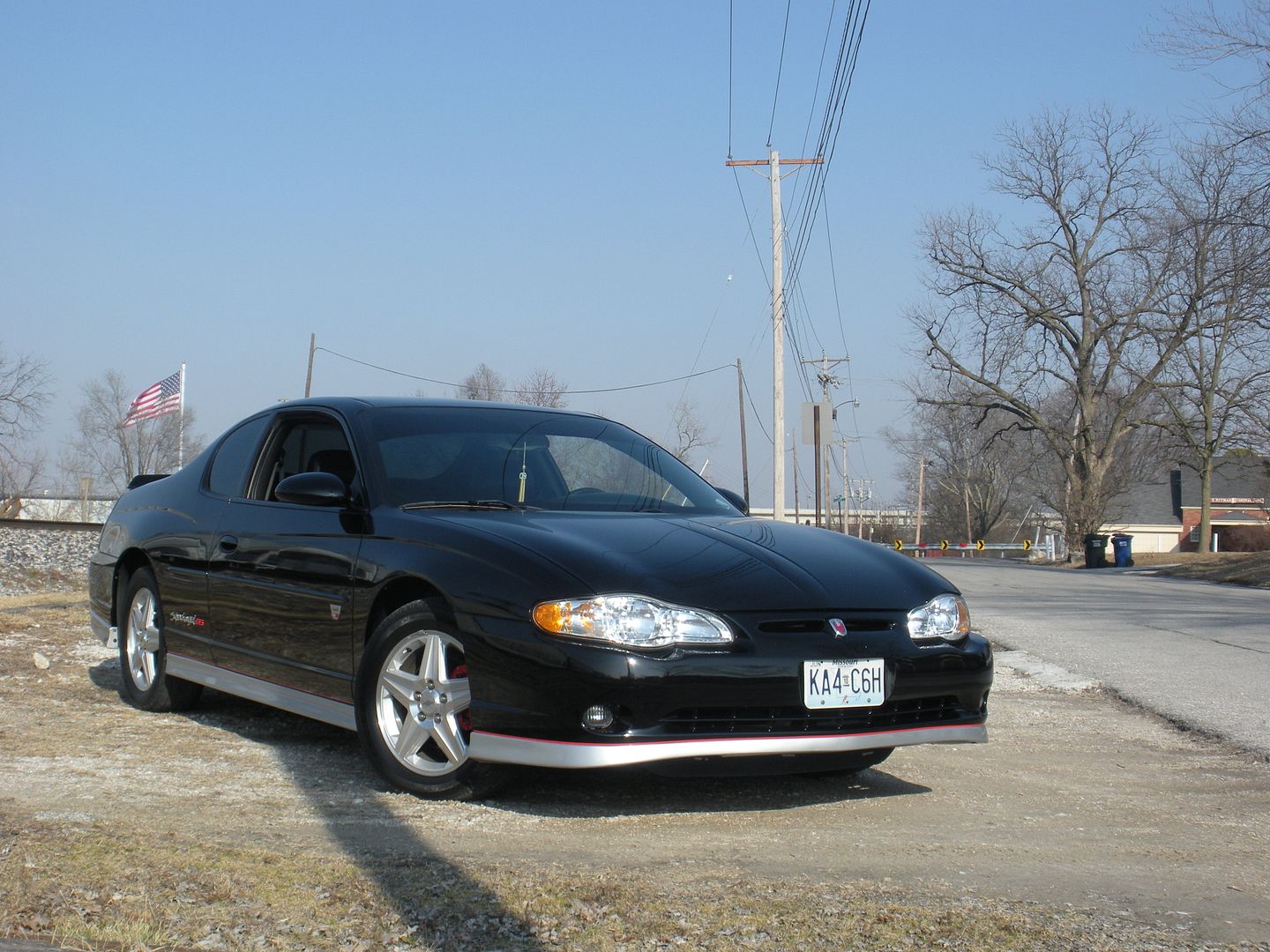
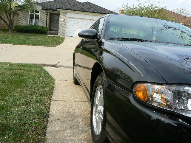
In this one I don't like the shadow or the garbage cans in the background. I agree the color balance works and the flag looks cool.
My pic isn't totally current either (no roof rails!) but it's probably the only photo I got without visble Budweiser logos
Last edited by JuniorCar; 09-15-2010 at 06:24 AM.
#13
09-15-2010, 09:21 AM


First, it's missing a number of things that have been added to the car since that picture was taken. Brittany, you already mentioned this. Plus, your licence plate pretty much stands out. That would be fine if you had a specialty/personalized plate. But a standard plate just takes attention away from the rest of the car.
Second, the power lines and utility poles. In that particular picture, the powerlines and utility poles just don't look good. If I was to use that picture for a calendar, I would photoshop them out.
Third, and very minor point is the shadow JuniorCar mentioned.
Fourth, the color. Or lack of good color. As a full color picture, it leaves much to be desired. What I would do is keep the flag and car in full color, and make the rest black & white.
If you look at a variety of car calendars, you tend to see pictures with rich, vivid colors. In my opinion, dull or soft colors don't work in a car calendar. Keep the soft colors for puppy calendars or any of those artsy-fartsy calendars of balloons and such.
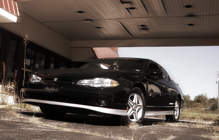
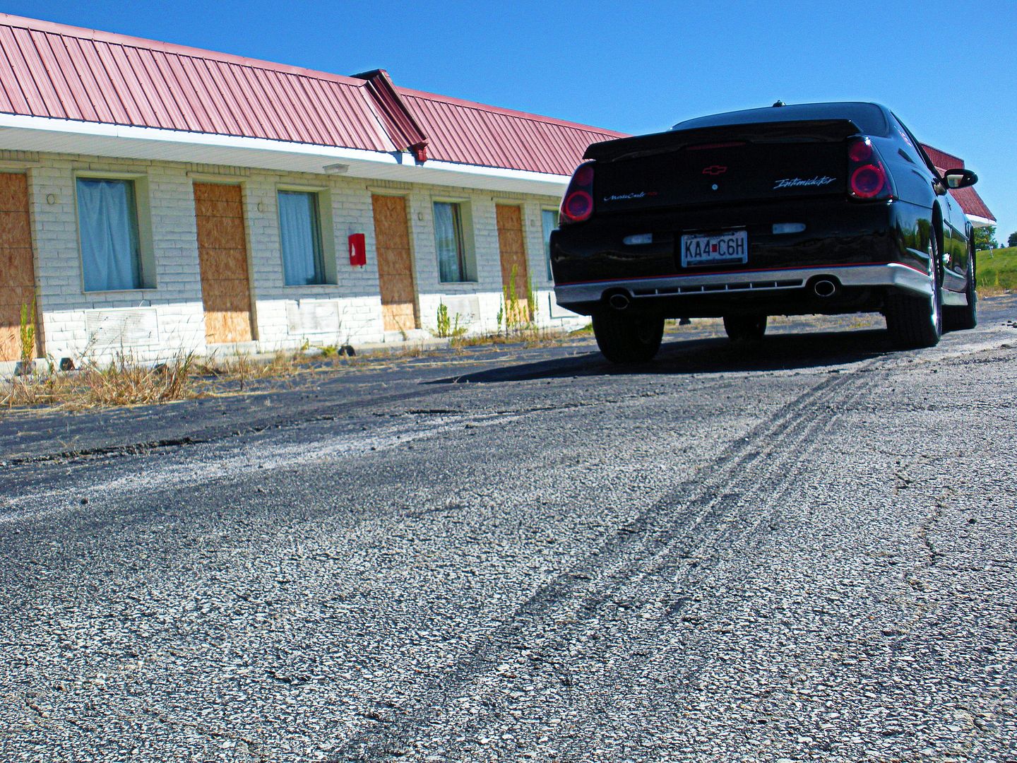
Personally, I like the last picture in the group of four on the previous page. The one with your car from the front passenger corner with the motel behind it. The vivid colors of the red rood and the blue sky really look nice.
I do have to admit that the first picture you posted from behind looked kinda cool with the skid mark. Gave a feeling of speed. Like you just pulled out, and are speeding away as the picture was taken.
#14
09-15-2010, 06:13 PM


Monte Of The Month -- June 2010
Join Date: Jul 2009
Location: Wentzville, Missouri
Posts: 4,528
Hmm you all make valid points. The check for my license plate just went through yesterday so hopefully I'll get it soon =) soooo excited! That one withe the marks would be perfect if I have my personalized plates on it (Spin3M). Idk but I gotta chose by tomorrow while I'm at school so I can send it after class before I go to work =/


#17
09-16-2010, 10:22 AM
Guest
Posts: n/a
#18
09-16-2010, 01:28 PM
Monte Of The Month -- June 2010
Join Date: Jul 2009
Location: Wentzville, Missouri
Posts: 4,528
Awww I'm trying to load the picture & the website isn't pulling up =( I was reallyyyy needing to get it uploaded before I left school today but hopefully my internet at home won't be dumb tonight to where I can upload it or I guess I'lll be going to McD's or someplace to use their WiFi =/
#19
09-16-2010, 01:45 PM
I think there's a problem with the servers, I can't pull up the website either